How to Read Crypto Candlestick Charts: Complete Beginner's Guide (2026)
— By Tony Rabbit in Tutorials
Candlestick charts are the language of crypto trading. This evergreen DEXTools guide breaks down the anatomy of a candle, the most useful patterns, the role of timeframe and structure, and the misreads that catch beginners every cycle.
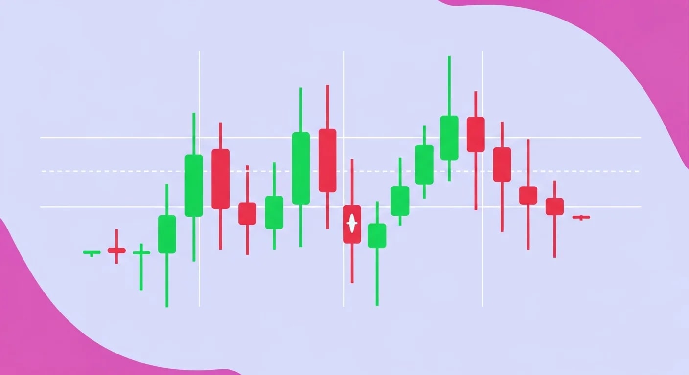
Candlestick charts are the default way crypto traders look at price. Open a DEXTools page, a TradingView chart, or any exchange interface, and you will see green and red bars stacked across a timeframe. Each one packs four data points into one shape, but most beginners only learn three: red is bad, green is good, and big candles are exciting. That is enough to get started but not enough to trade well.
Quick answer: A candlestick is a chart shape that shows the open, close, high, and low for a single time period. The wide part is the body, the thin lines above and below are wicks, and the color shows whether the close was higher or lower than the open. Reading candlesticks well means understanding what those four prices imply about who was in control during that period, and pairing that with structure rather than treating each candle as a standalone signal.
- A candle is a four-price summary. Every candle stores the open, close, high, and low for that timeframe.
- The body shows control. A long body means the dominant side controlled most of the period. A small body means uncertainty.
- Wicks show rejection. Long wicks reveal price was tested and pushed back, often near key levels.
- Patterns matter only at meaningful levels. The same hammer can be a great signal at support and a meaningless candle in the middle of nowhere.
- Timeframe defines reliability. Higher timeframe candles cut noise. Lower timeframe candles produce more signals, mostly noise.
The anatomy of a single candlestick
Every candle starts with four prices: the price at the start of the period (open), the highest price reached during the period (high), the lowest price reached during the period (low), and the price at the end of the period (close). Those four numbers are drawn as a colored rectangle with thin lines stretching above and below.
The rectangle is the body, and it spans from open to close. If the close is higher than the open, the body is typically green or hollow, and the candle is bullish. If the close is lower than the open, the body is typically red or filled, and the candle is bearish. The thin lines above and below the body are wicks, sometimes called shadows. They show how far price stretched outside the open-close range during that period before settling at the close.
Body, wicks, and what they imply
A candle with a long body and short wicks tells a clean story. One side dominated the period, and price barely deviated. A candle with a short body and long wicks tells a messy story. Both sides fought, and price closed near where it started. The implication is not "buy" or "sell" by itself. It is who is currently in control of that period and how confident that control was.
Long upper wicks often reveal that price tried higher but sellers pushed it back down. Long lower wicks often reveal that price tried lower but buyers stepped in. These rejections are most meaningful at known levels, where they suggest the level is being defended. In the middle of a noisy range, the same wicks usually mean nothing.
Bullish vs bearish candles
Bullish candles close above their open. Bearish candles close below their open. That is the entire color rule, but it carries weight because the close is the price the period agreed on. Markets respect closes more than wicks, which is why traders care about whether a level "held on a close" rather than "held on a wick." A daily wick below support that closes above is far less damaging than a daily close below support, even if the wick was deeper.


The candlestick patterns that actually matter
Pattern dictionaries can list hundreds of formations. Most of them are statistical noise. The patterns worth knowing are the ones tied to real market behavior at real levels.
Doji and indecision candles
A doji is a candle where the open and close are nearly identical, leaving a tiny body and visible wicks above and below. Dojis represent indecision. Buyers and sellers fought to a draw. By itself, a doji is not a signal, but a doji at the top of a long rally or at the bottom of a long sell-off can mark the moment momentum stopped agreeing with the trend.
Hammer and shooting star
A hammer has a small body near the top of the candle range and a long lower wick that is at least twice the body size. It often appears at the bottom of a move and shows that price probed lower but was rejected back up. A shooting star is the inverse: a small body near the bottom of the range and a long upper wick. It often appears at the top of a move and shows that price probed higher but was sold off.
Both candles are weak signals in isolation. They become useful when they form at clear levels, on higher timeframes, with confirming follow-through. A daily hammer wicking into a long-watched support zone is a different signal from a one-minute hammer in the middle of nowhere.
Bullish and bearish engulfing
An engulfing pattern is two candles where the second body fully covers the first body. A bullish engulfing happens when a green candle's body completely covers the previous red candle's body. A bearish engulfing is the inverse. These patterns matter because they show a clean shift in control between two periods. After a sequence of weak red candles, a bullish engulfing is a more confident signal than a single random green candle, especially at structure.
Three-bar reversal patterns
Patterns like morning star and evening star are three-candle setups that mark momentum exhaustion and reversal. A morning star is a long red candle, a small indecision candle, and a long green candle, often appearing at lows. An evening star is the inverse, often appearing at highs. They are more reliable than single-candle signals because they require a multi-period story rather than a single moment of action.
Why context beats pattern memorization
The single biggest mistake new traders make with candlesticks is treating patterns as commands. The exact same hammer at the bottom of a healthy uptrend is a different setup from a hammer in the middle of a relentless bear leg. The pattern itself is mostly geometry. The level, trend regime, volume context, and follow-through are what give it weight.
Patterns at meaningful levels
The most reliable use of candlestick patterns is at levels traders already cared about before the pattern appeared. A long lower wick into a multi-week support is a louder rejection than the same wick at a random midrange price. A bearish engulfing into a long-watched resistance carries more weight than the same engulfing in the middle of a chop zone. The level is not optional context. It is half of the trade.
Trend versus range regimes
In strong trends, reversal patterns often fail. A bearish engulfing inside a vertical bull move is much more likely to be absorbed than to mark a top. In well-defined ranges, reversal patterns at the edges work better because the structure itself encourages mean reversion. The trader's job is to identify the regime first and only then apply the pattern.
Higher timeframes filter noise
The exact same pattern is far more reliable on a daily chart than on a one-minute chart. Lower timeframes contain a higher ratio of noise candles, where market makers, automated systems, and short-lived order flow imbalances create shapes that look like signals but mean nothing in the broader picture. Beginners who chase patterns on five-minute charts often eat dozens of false signals before getting one real one.


Choosing the right timeframe for crypto candlesticks
There is no perfect timeframe. The right one depends on the trader's holding period, risk tolerance, and ability to monitor the market.
Daily and weekly for trend context
The daily and weekly timeframes are the cleanest for understanding where price is. Major reversal patterns on those charts tend to mean something. They also reduce the amount of screen time required to make decisions, which is one of the underrated advantages of trading higher timeframes.
Four-hour for execution
The four-hour chart is a popular middle ground. It is fast enough to give entries and exits multiple times per week and slow enough to filter most of the noise that ruins lower timeframe trades. Many crypto traders organize their work around the four-hour chart while using the daily and weekly for context.
Sub-hour timeframes are for execution, not for thesis
One-minute, five-minute, and fifteen-minute charts are useful for fine-tuning entries and exits once a thesis already exists. They are usually a bad place to form a thesis, because the noise-to-signal ratio is high and patterns appear constantly. Use them to time the trade, not to decide whether to take it.
Common candlestick misreads

Most candlestick mistakes are not about the candle itself. They are about ignoring the context around it.
- Trading single candles in isolation: a hammer with no level, no trend context, and no follow-through is barely better than random.
- Ignoring the close: price wicks beyond a level constantly. The closes are what matter for structure.
- Forcing patterns onto noisy charts: illiquid pairs and manipulated tokens print all sorts of shapes that look like patterns but are produced by a few wallets.
- Using only one timeframe: a pattern on a single timeframe with no higher-timeframe agreement is fragile by design.
- Memorizing names instead of behavior: the names are easy. The underlying behavior of buyers and sellers is what makes a pattern useful.
Practical workflow for DEXTools and TradingView users
The cleanest workflow is a top-down read. Start with the broader market context. Then zoom into the specific pair. Then plan the trade. Then check the candle behavior at the level you actually care about.
- Mark structure first. Highlight major support and resistance, trend direction, and prior reaction levels.
- Filter pairs on DEXTools. Confirm there is enough liquidity and volume for the chart to even respect technical levels.
- Watch candles at levels, not in midair. Wait for behavior at structure rather than reacting to every shape that looks like a pattern.
- Cross-check with companion tools. RSI and MACD often clarify whether a candle reaction has real momentum behind it.
If you also want broader chart-reading help, point readers to how to read liquidity pool data before buying a token instead of stretching this article into a separate beginner workshop.
Bullish vs bearish setups in one short comparison
| Setup type | Key features | Best context |
|---|---|---|
| Bullish | Hammer, bullish engulfing, morning star | At meaningful support inside a healthy trend or range |
| Bearish | Shooting star, bearish engulfing, evening star | At meaningful resistance inside a downtrend or range top |
| Indecision | Doji, spinning top, inside bar | At pivot zones where the next break decides direction |
Frequently asked questions
How do I read a single candlestick?
Read the body to see who controlled the period, the wicks to see where price was rejected, and the color to see whether the close was higher or lower than the open. The candle summarizes four prices into one shape.
Which candlestick patterns are most reliable in crypto?
Engulfing patterns and three-candle reversals like morning star and evening star tend to be more reliable than single-candle patterns, especially when they appear at known levels on higher timeframes.
What timeframe should beginners use for candlestick analysis?
The daily and four-hour timeframes are good places to start. They contain enough context to make patterns meaningful while filtering out the worst of the lower-timeframe noise.
Can I trade purely from candlestick patterns?
It is rarely a good idea. Patterns become useful when combined with structure, volume, and trend context. Treating them as standalone signals leads to a long string of false trades.
Are crypto candlestick charts different from stock charts?
The mechanics are identical, since both use open, close, high, and low. The differences are in volatility, market hours, and liquidity profile. Crypto markets trade 24/7 and can move much faster, which makes higher-timeframe candle context even more important.
Final takeaway: Candlesticks are not a magic language. They are a clean way to summarize four prices and the behavior behind them. Read structure first, treat patterns as confirmation at meaningful levels, and the same chart that confused you last cycle starts to look readable.
Disclaimer: This guide is for educational purposes only and does not constitute investment, financial, legal, or trading advice. Patterns can improve context, but they do not remove risk.
Related Guides
- Candlestick Patterns Cheat Sheet: 35 Crypto Setups Explained (2026)
- How to Read DEXTools Charts for Beginners
- How to Read Crypto Charts for Beginners: Candlesticks, Indicators and Patterns (2026 Tutorial)
- How to Detect Fake Volume in Crypto: Memecoin Red Flags (2026)
- Meme Coin Chart Indicators and Charting Sites (2026)
Frequently Asked Questions
How do you read a crypto candlestick chart?
Each candle shows the open, high, low, and close for a chosen time period, with the body marking the open-to-close range and the wicks marking the extremes. A close above the open usually shows buying pressure, while a close below the open usually shows selling pressure.
What does the wick on a candlestick mean?
The wick, or shadow, shows the highest and lowest prices reached during the period beyond the open and close. Long wicks signal that price was rejected at those levels, hinting at where buyers or sellers stepped in.
What is the difference between green and red candles?
A green or bullish candle means the closing price was higher than the opening price for that period, while a red or bearish candle means it closed lower than it opened. Color conventions can be customized, so it is the open-versus-close relationship that matters.
Which timeframe should beginners use for candlestick charts?
There is no single correct timeframe, since shorter timeframes show more noise and longer timeframes show broader trends. Many traders compare multiple timeframes to understand both the immediate move and the larger structure.